After many, many months of research, asking questions, listening, preparing, and creating www.salemhome.ca has been completely revamped and has become a brand new website.
We had to ask ourselves why we wanted a new website, and what we wanted it to be used for. The old website was a whole lot of words and dated pictures, which did not match the life and feeling at Salem Home at all.
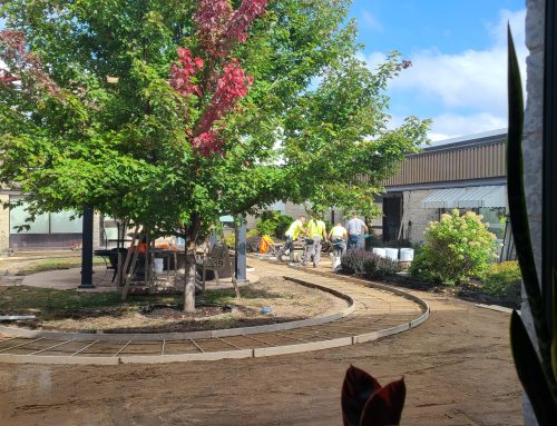
With the new website the goal was to showcase the community at Salem Home. We wanted to explain who we are at Salem in as few words as possible. We only used pictures from real life at Salem Home because who better to represent what we do, then the people who live and work here every day. Every part of the website is designed to have meaning and purpose to it, even the colours we used represents our Mission Statement

We wanted our website to be a resource for families, staff and volunteers to go to and find the information that they need easily, like what’s for lunch under “What’s Happening” tab or watch a video on Dysphagia and Diet textures under the Resources tab.
Now go and take a look and let us know which part is your favorite or if you have any ideas of what we might have missed. You can contact us here


